 contact-center
Sections and Content Blocks
When building an email in the Email Editor, the layout is made up of two main elements: sections and content blocks.
Understanding the difference between them helps you build structured email layouts more efficiently.
Sections
A section defines the structure of part of the email layout. It acts as a container for content blocks and helps control how content is arranged inside the email.
In contact.center™, you can use sections to organize content into separate layout areas, such as headers, body content, calls to action, and footer content.
You can add sections to your design in several ways:
Create your own section Drag and drop content blocks directly into the email canvas to automatically create a new section.
Use a pre-designed section Go to Content > Sections to choose from ready-to-use layouts that include images, text, and columns you can customize. To learn more about pre-made sections, see Use Pre-designed Sections.
Save and reuse your own section Reuse sections you created earlier by saving them beforehand. This is useful for recurring layouts such as headers, footers, or product showcases. To learn more about saved sections and reusable components, see Save sections for reuse in your email designs.
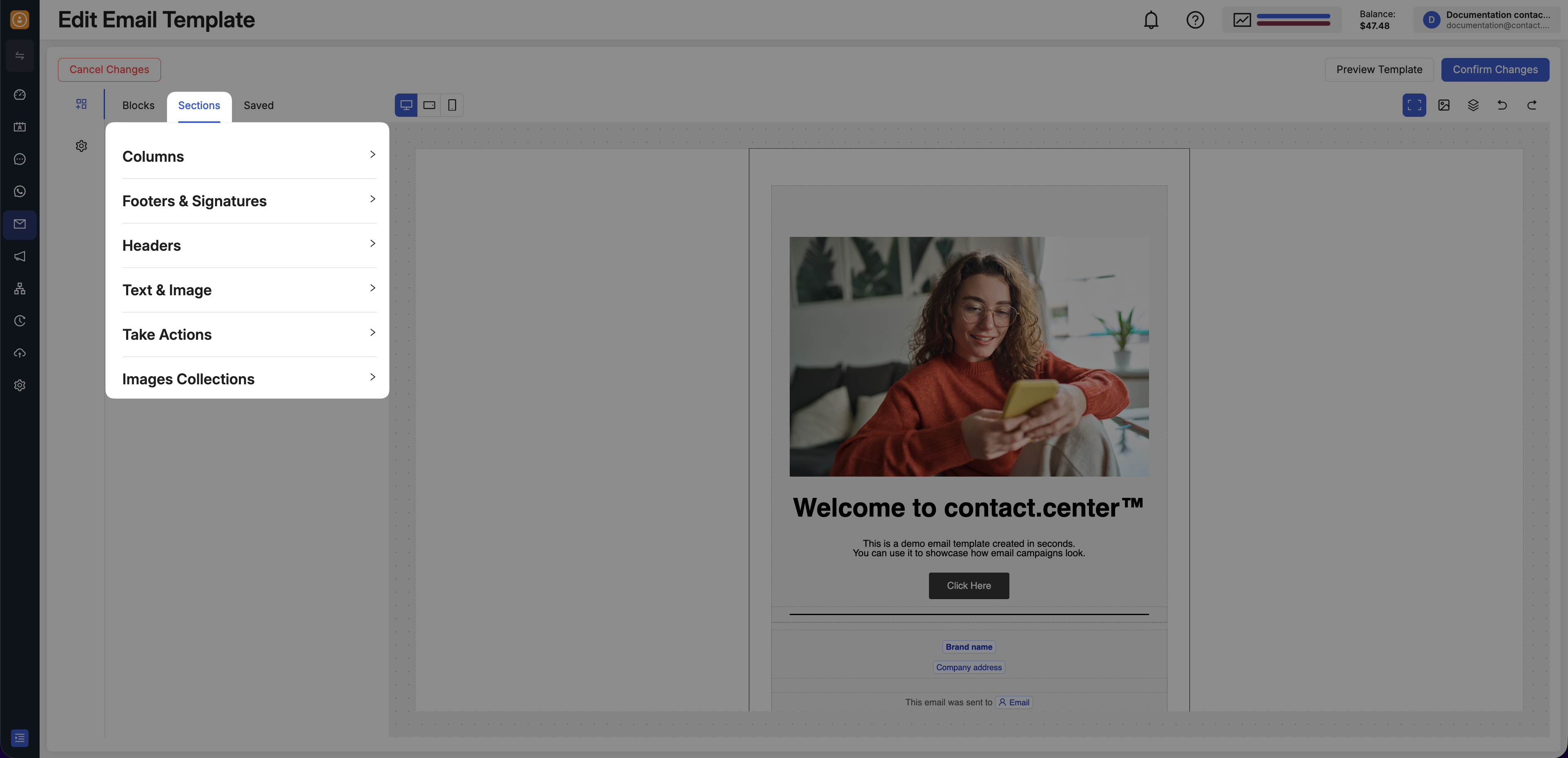
Fig. 1. Sections in the Email Editor.
Customize Sections
Once you’ve added a section, you can customize its layout and style by selecting the section or row in the canvas to open its settings in the left panel.

Fig. 2. Open section settings from the canvas.
These settings help you control how content is arranged and displayed in your email:
Setting |
Description |
|---|---|
Columns |
Choose how many columns the section uses and adjust the row structure for side-by-side content. |
Spacing |
Manage the space around the section to improve readability and keep the layout balanced. |
Background |
Apply background styling to help sections stand out or blend into the rest of the design. |
Borders |
Adjust border styling and corner rounding to refine the look of the section container. |
Section FAQs
These common questions cover the section-level actions you are most likely to use while building and adjusting your email layout.
Add or Delete a Column
After you add content to the canvas, you can select the section or row and use the available Columns controls to adjust the layout.
Once you’ve added a content block within the email canvas, you can add columns by clicking the section and using the + controls in the section settings. You can also delete a column by selecting it and using the trash icon.
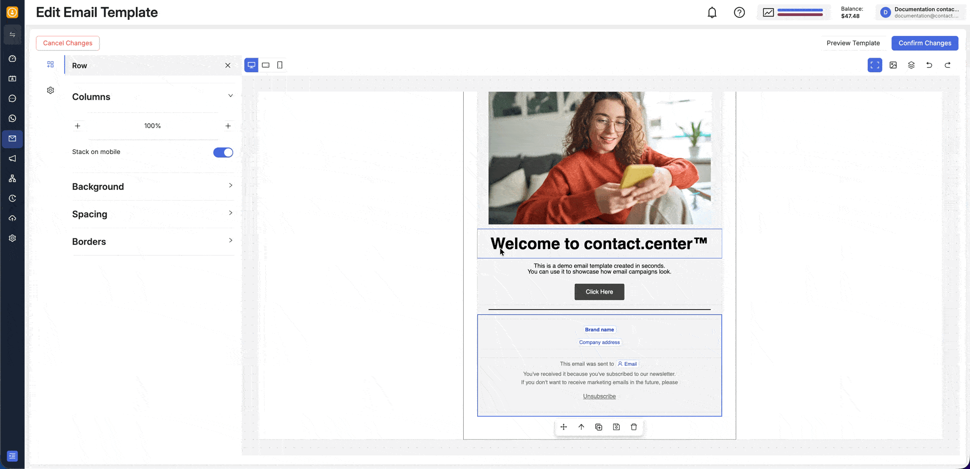
Fig. 3. Add or delete a column in a section.
Duplicate or Move a Section
To duplicate a section, select it and click the duplicate icon. You can then move the section by selecting and dragging it to the desired location. Alternatively, you can use the move icon or the up and down controls to move the section one position higher or lower in the layout.

Fig. 4. Duplicate or move a section in the canvas.
Check Where a Content Block Will Be Added
When you drag a content block into the canvas, the placement indicator shows where the block will be inserted.
If the highlighted insertion area spans the full width of the canvas, the block will be added as a new section. If the insertion line appears inside an existing row or column, the block will be inserted within that section.
You can also click the section or row in the canvas to confirm which blocks belong to that part of the layout.
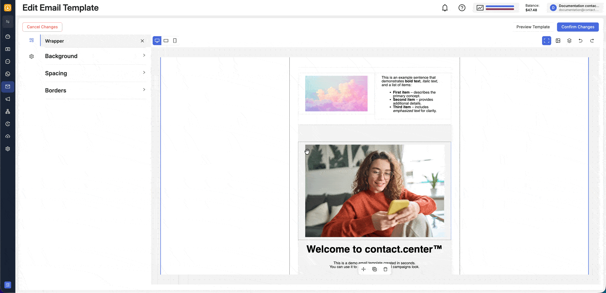
Fig. 5. Check whether a content block will be inserted inside a section or as a new section.
Use Stack on Mobile
To control how columns appear on mobile, select the section and switch to mobile view from the top bar. In the left panel, use the Stack on mobile toggle to choose how the columns behave on smaller screens.
When Stack on mobile is enabled, the columns stack vertically. When it is disabled, the columns remain side by side in mobile view.
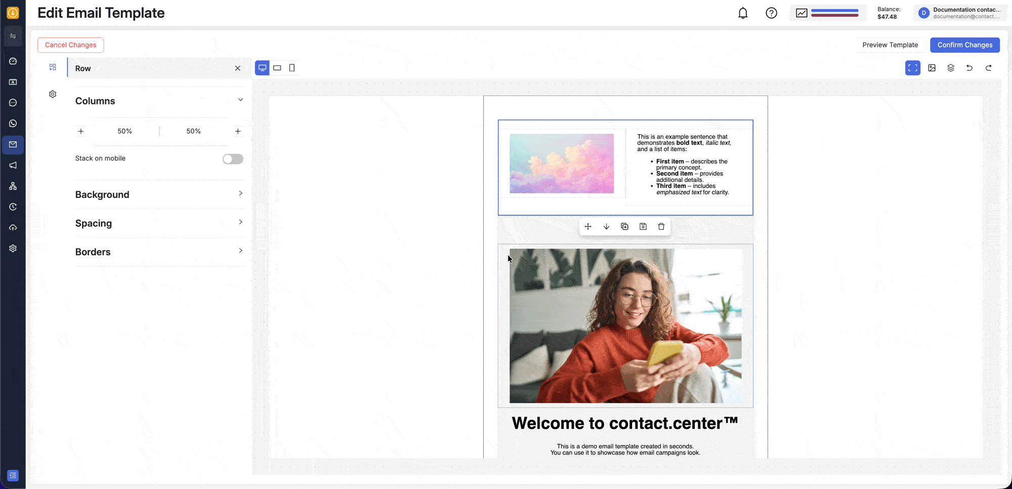
Fig. 6. Adjust mobile column behavior for a section.
Add a Divider
To add a visual separator, insert a Divider block between content blocks inside a section.
The divider helps break up content areas and makes longer layouts easier to scan.
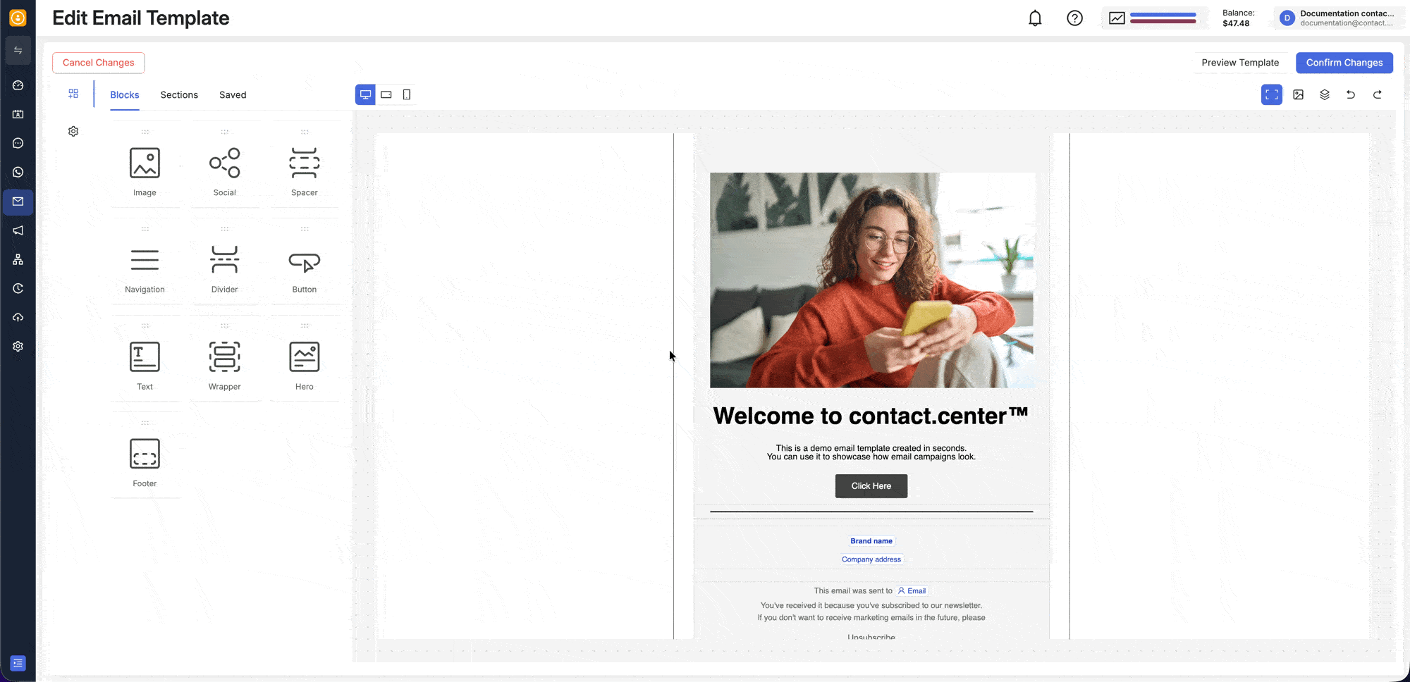
Fig. 7. Add a divider block to visually separate content inside a section.
Content Blocks
A content block is a specific type of content that you add inside the email layout.
Content blocks are used to build the actual content of the email. Each block is designed for a particular purpose, such as displaying text, images, links, or footer information.
Fig. 8. Content blocks in the Email Editor.
You can find the available blocks in Content > Blocks and drag them into the email canvas.
The available content blocks are:
The Image block lets you add visuals to your email, such as banners, logos, product images, and other graphics.
You can configure alternate text, replace the image, insert an image from a URL, adjust layout and spacing, and add links with tracking options.
To learn more about the Image content block, see Add and Edit Images.
The Social block lets you add linked social media icons to your email layout.
You can use it to place branded social links in the header, body, or footer, and adjust icon appearance, layout, background, spacing, and borders.
To learn more about the Social content block, see Add Social Media Icons.
The Navigation block lets you add a menu with links to key pages or sections.
You can use it near the top of the email to help recipients quickly navigate to important content.
To learn more about the Navigation content block, see Add Navigation Links.
The Divider block adds a horizontal visual separator between parts of the email.
You can use it to break up longer content, distinguish sections, and make the layout easier to scan.
To learn more about the Divider content block, see How can I visually separate content with a break line?.
The Button block helps you create a clear call to action in your email.
You can configure the destination link, tooltip, tracking, layout, spacing, text styling, background, and borders to make the action stand out.
To learn more about the Button content block, see Add a Button.
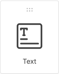
The Text block lets you add written content such as headings, paragraphs, short notices, and supporting details.
You can adjust its layout, background, spacing, and text styling to match the rest of your email design.
To learn more about the Text content block, see Insert a Text Content Block.
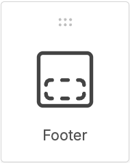
The Footer block lets you add closing content to your email, such as sender details, company information, unsubscribe-related content, and other footer elements.
You can place and style footer content directly in the editor layout so the end of the email stays consistent with the rest of the design.
Customize Content Blocks
When you select a content block in the canvas, the settings panel opens and shows the available options for that block.
Each content block has its own settings. To learn more about each content block and their settings, open the corresponding accordion in the list of available content block above to access their dedicated articles.
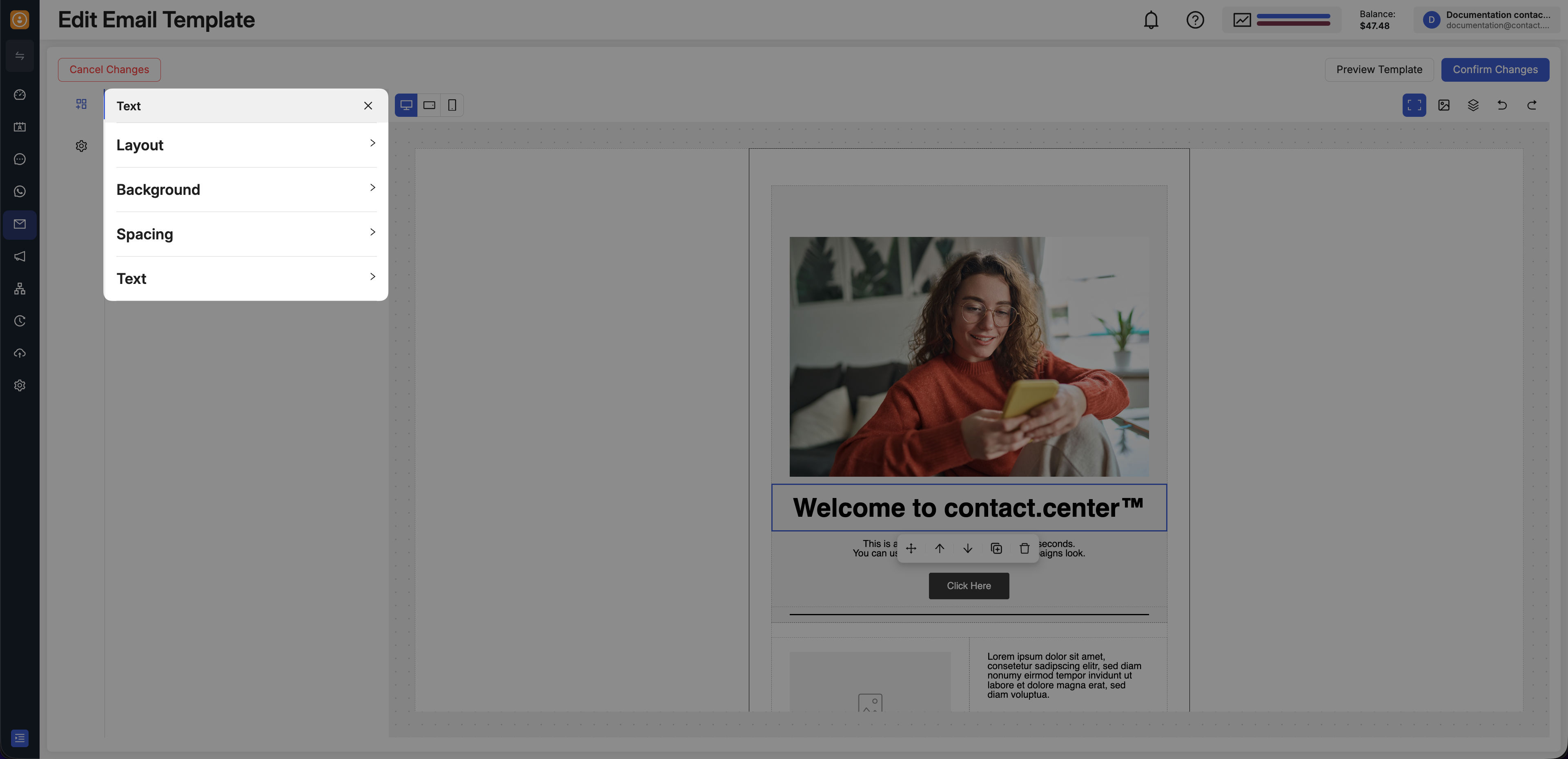
Fig. 9. Content block settings in the Email Editor.
Content Block FAQs
These questions focus on common content-block actions you may need after you start placing and rearranging content in the canvas.
Move a Content Blocks
To move a content block within a section or to another section, drag and drop it to the desired position in the canvas.
This lets you reorganize blocks inside the same section or place them into a different section as you refine the email layout.
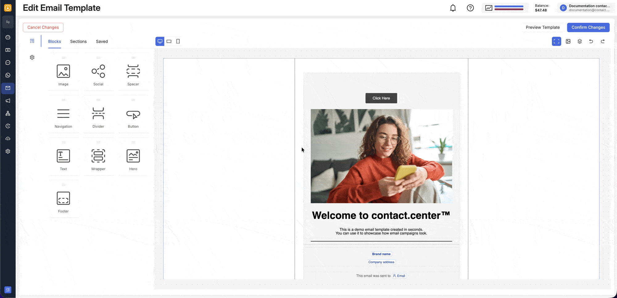
Fig. 10. Move a content block within a section or to another section.
Create a Layout with Images and Text
To create a layout with images and text, drag the blocks you want into the email canvas and arrange them in the order you need.
You can place them in the same section or use multiple sections, then replace the placeholder text and images with your own content.
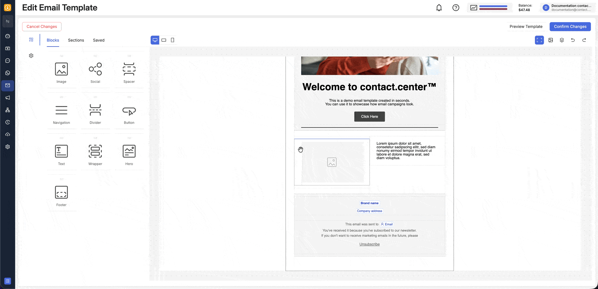
Fig. 11. Create a layout with images, text, and a button.