 contact-center
Overview
The Email Editor in contact.center™ helps you create email templates visually with no coding required. You can build your layout with content blocks, use ready-made sections, reuse saved components, and preview the final result before saving it.
Access the Email Editor
To start building with the Email Editor:
Go to Email > Templates.
Click Create New or Edit an existing template.
In the template selection wizard, choose Build from scratch, or select a template that opens in the visual editor.
The editor opens after you complete the template setup step and click the button to start editing the email content.
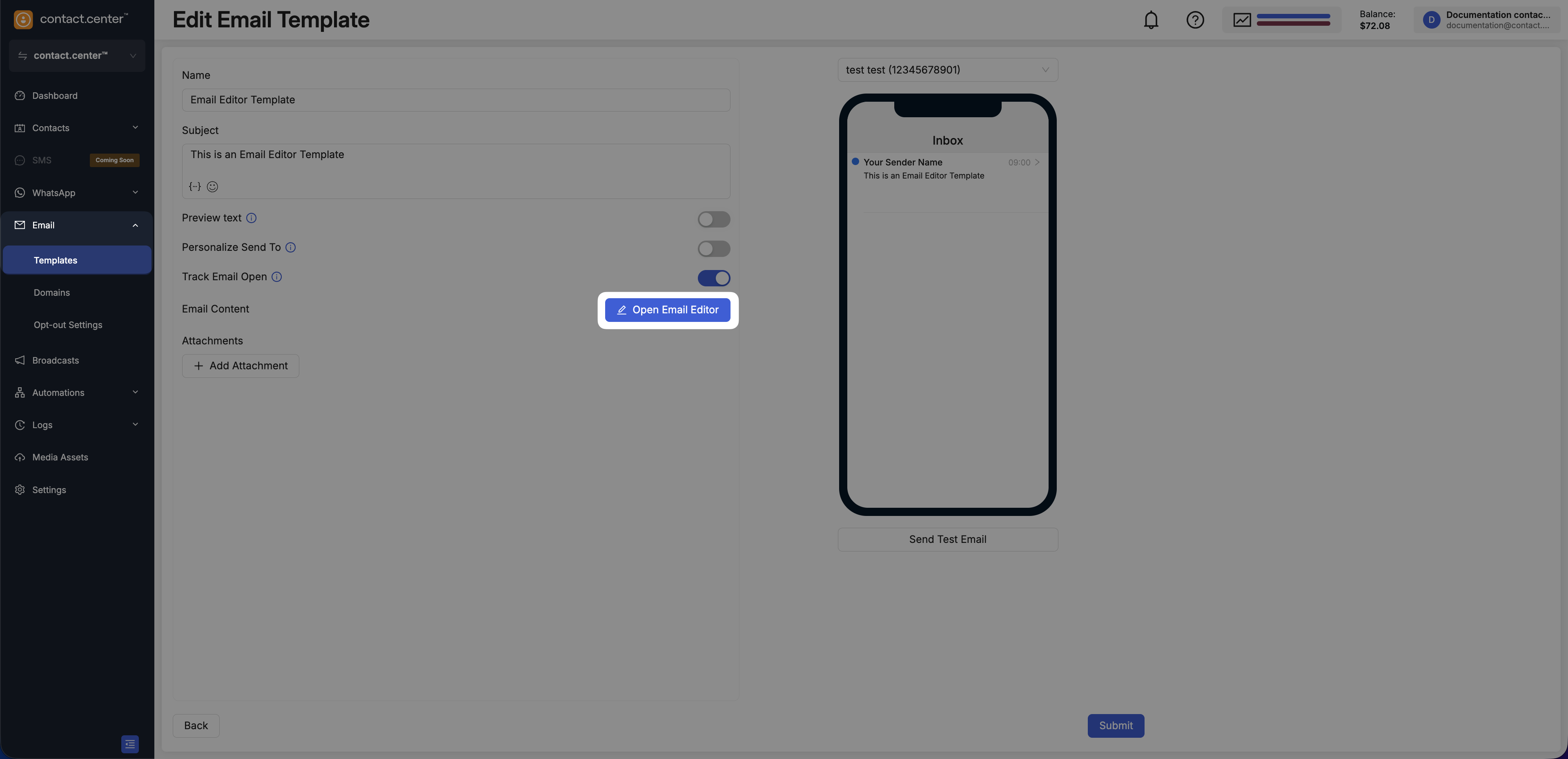
Fig. 1. Open the Email Editor from the email template flow.
Email Canvas
The Email Canvas is the central workspace where you design the structure and content of your email.
It provides a visual, real-time representation of the email, allowing you to see how the layout and content appear as you build it. The canvas follows a what-you-see-is-what-you-get (WYSIWYG) approach, so the design you create closely reflects the final result.
You can build your email by dragging elements from the left panel into the canvas and arranging them into rows and sections. Each element appears directly in place, making it easy to understand the layout and overall structure of the email.
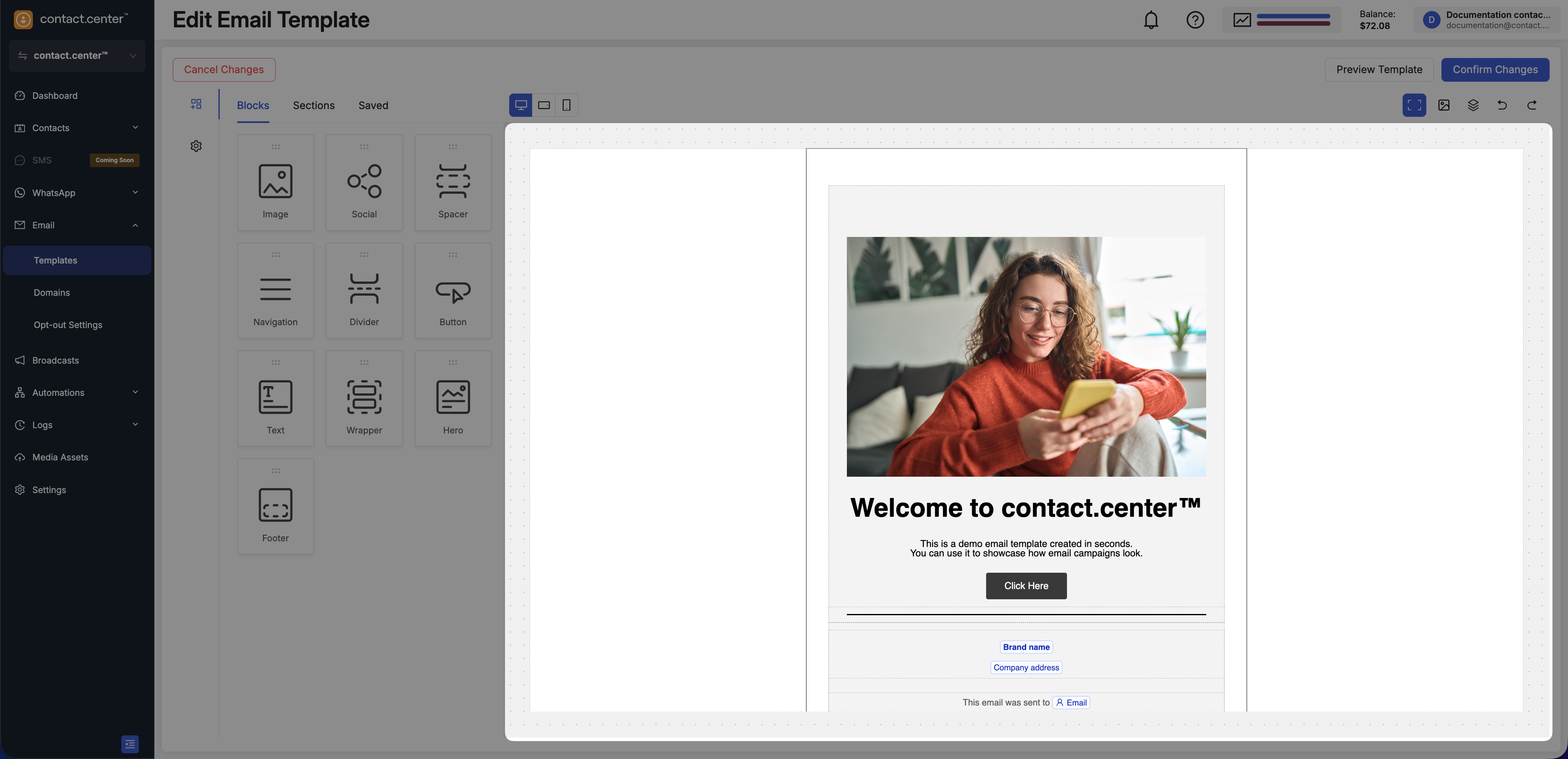
Fig. 2. The Email Canvas.
Left Panel
The left panel is the main control area for building and styling the email.
Depending on what you open, the left panel shows:
The Content area with the Blocks, Sections, and Saved tabs
The Settings area for email-wide configuration
The settings for the selected row or content block
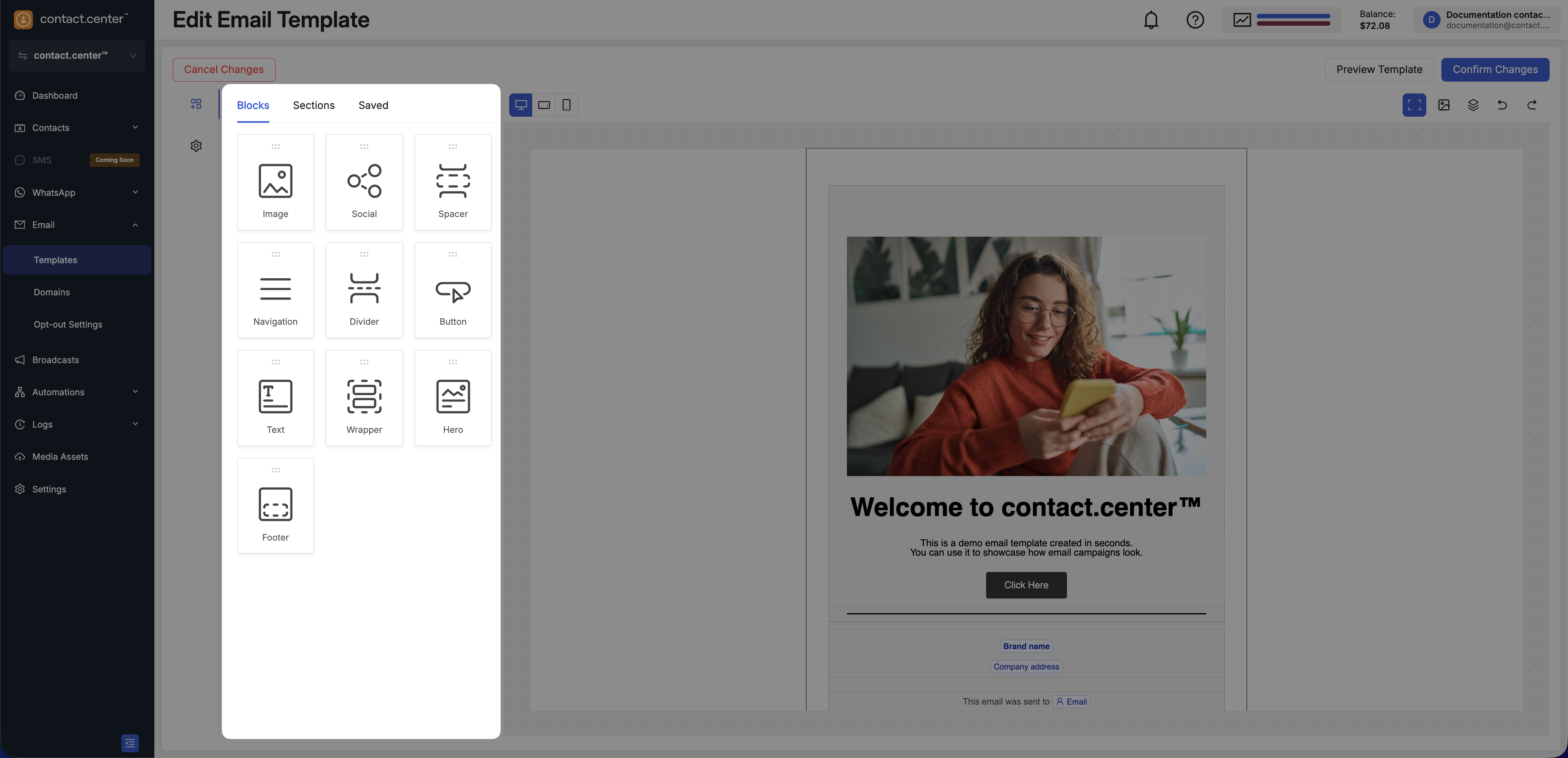
Fig. 3. Left navigation panel in the Email Editor.
Content
The Content area contains the building blocks of your email. It is divided into three tabs:
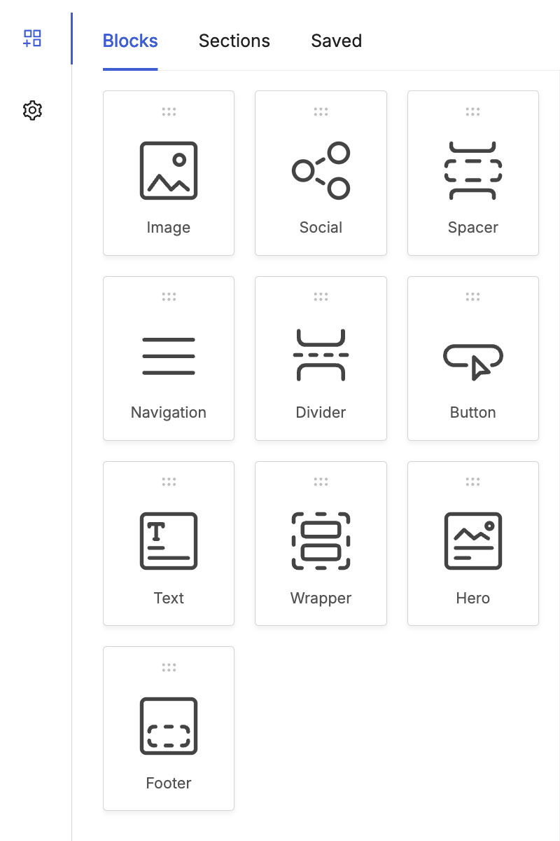
Fig. 4. Blocks tab in the Content panel.
The Blocks tab contains the individual content elements you can drag into the email canvas.
These blocks are used to create the actual content of the email, such as text, images, buttons, and footer elements.
Available Content Blocks
The following content blocks are available in the Email Editor.
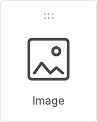
The Image block lets you add visual content to your email, such as banners, logos, product images, and other graphics.
You can place images in different parts of the layout and configure image-related properties after adding the block to the canvas.
To learn more about the Image content block, see Sections and Content Blocks.
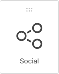
The Social block lets you add social media icons with links to your social channels.
You can use this block to place branded social links in the header, body, or footer of your email.
To learn more about the Social content block, see Add Social Media Icons.
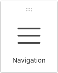
The Navigation block lets you add a menu with links to key pages or sections.
You can use this block near the top of the email to help recipients quickly navigate to important content.
To learn more about the Navigation content block, see Add Navigation Links.
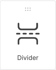
The Divider block lets you add a visual separator between sections of your email.
You can use this block to organize content and make longer emails easier to scan.
To learn more about the Divider content block, see How can I visually separate content with a break line?.
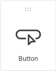
The Button block lets you add a call to action to your email.
You can use this block to direct recipients to a page, confirm an action, or highlight a promotion.
To learn more about the Button content block, see Add a Button.
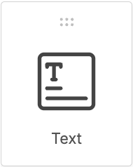
The Text block lets you add written content to your email, such as headings, paragraphs, and notes.
You can use this block throughout the layout to present the main message of your email.
To learn more about the Text content block, see Insert a Text Content Block.
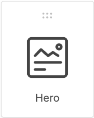
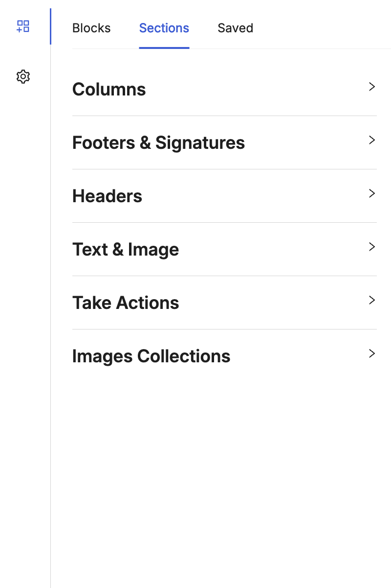
Fig. 5. Sections tab in the Content panel.
The Sections tab contains pre-designed layouts you can use to build emails faster.
A section defines the structure of a part of the email. After adding a section, you can still edit its rows, columns, and content blocks.
Available Section Categories
The following section categories are available in the Email Editor.
The Columns category lets you add section layouts with multiple columns.
You can use these sections to organize content side by side, such as text, images, or buttons.
To learn more about pre-designed sections, see Save time designing your emails with pre-designed sections.
The Footers & Signatures category lets you add predefined footer and signature layouts.
You can use these sections for contact details, company information, sign-offs, and other closing content.
To learn more about pre-designed sections, see Save time designing your emails with pre-designed sections.
The Headers category lets you add predefined header layouts at the top of the email.
You can use these sections for logos, titles, navigation links, and other branding elements.
To learn more about pre-designed sections, see Save time designing your emails with pre-designed sections.
The Text & Image category lets you add combined layouts with text and visual content.
You can use these sections to present messages alongside supporting images.
To learn more about pre-designed sections, see Save time designing your emails with pre-designed sections.
The Take Actions category lets you add call-to-action focused layouts.
You can use these sections to highlight actions such as clicking a button, visiting a page, or responding to an offer.
To learn more about pre-designed sections, see Save time designing your emails with pre-designed sections.
The Images Collections category lets you add layouts that display multiple images together.
You can use these sections to showcase galleries, product collections, or grouped visuals.
To learn more about pre-designed sections, see Save time designing your emails with pre-designed sections.
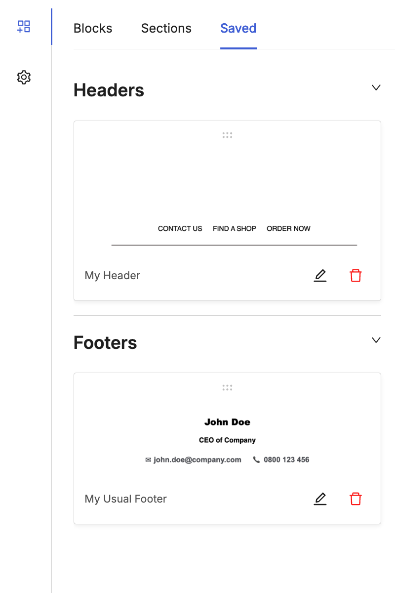
Fig. 6. Saved tab in the Content panel.
The Saved tab contains components that were previously saved for reuse.
Using saved content helps keep templates consistent and reduces repetitive editing work.
Top Navigation Bar
The top navigation bar provides quick access to controls for reviewing, adjusting, and saving your email while you work in the editor.
You can use these controls to preview how the email appears on different devices, manage recent changes, and confirm or discard your edits.
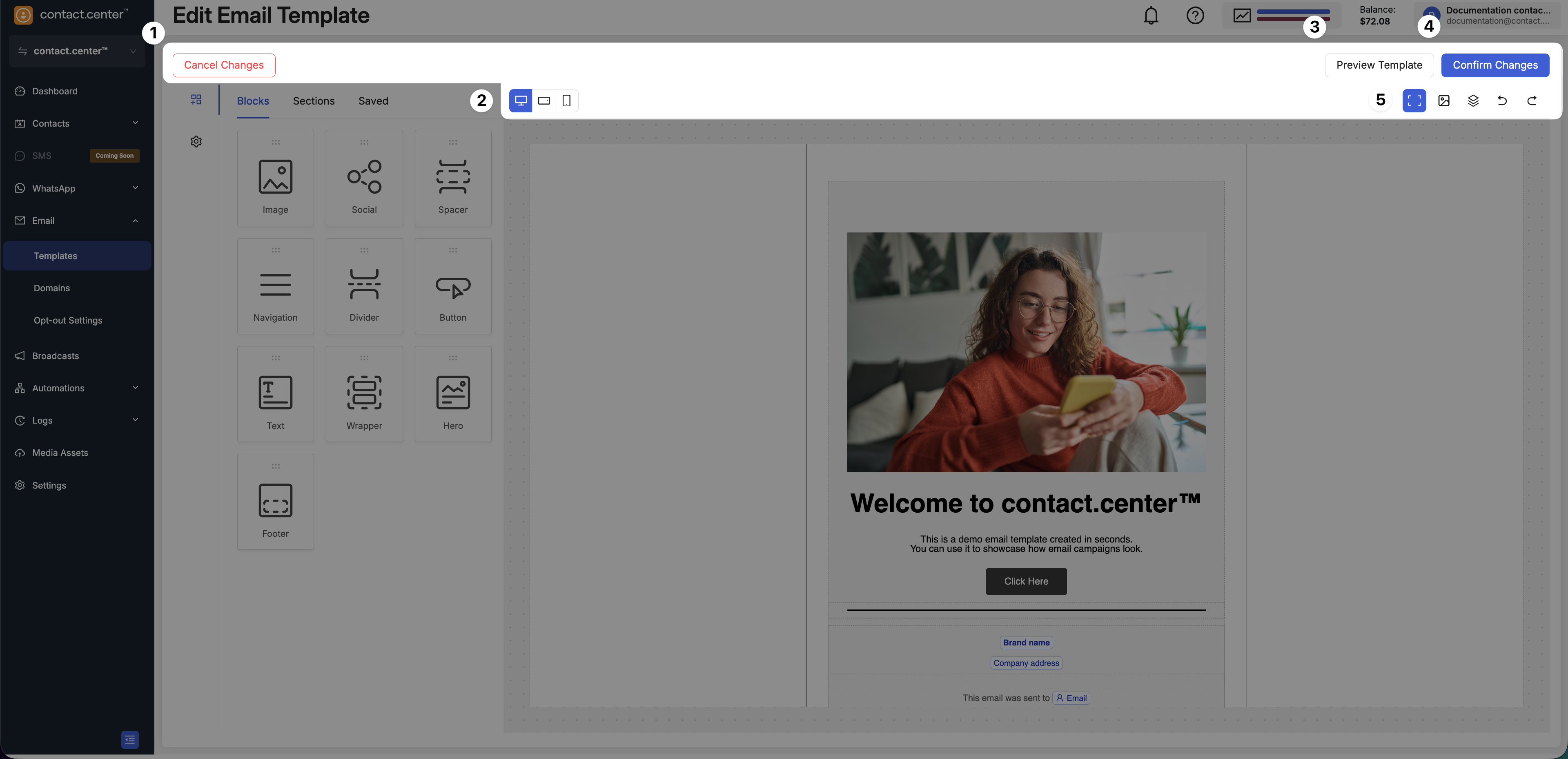
Fig. 7. Top navigation bar in the Email Editor.
The top navigation bar includes the following controls:
Cancel Changes - Exit the editor without applying recent changes to the template.
Device view switch - Switch between desktop, tablet, and mobile views to review how the email layout adapts to different screen sizes.
Preview Template - Open a preview of the email to see how the final message will appear to recipients.
Confirm Changes - Save the current version of the template and apply your changes.
View and editing controls - Adjust the editor view and manage recent actions. Use these controls to adjust the editor view and manage recent actions:
Show or hide borders - Display or hide layout borders to better understand the structure of the email.
Show or hide images - Temporarily hide images to focus on layout and text content.
Structure panel - Show or hide the email structure panel for easier navigation between elements.
Undo - Revert the last action performed in the editor.
Redo - Restore the last undone action.